News & Analysis at your fingertips.
Notify me about
H
HighM
MediumL
Low 55m
55m
Note: Low and High figures are for the trading day.
Data provided by
55m
Note: Low and High figures are for the trading day.
Data provided by
55m
Note: Low and High figures are for the trading day.
Data provided by
55m
Note: Low and High figures are for the trading day.
Data provided by
55m
Note: Low and High figures are for the trading day.
Data provided by
55m
Note: Low and High figures are for the trading day.
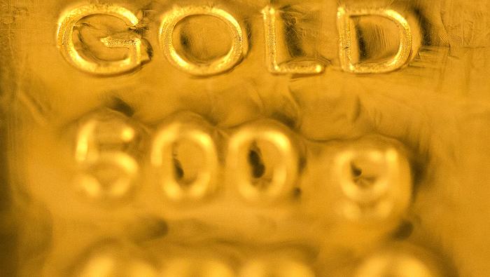
Data provided byUS Core PCE y/y unchanged at 2.8% vs. 2.6% expectations
PCE Price Index y/y at 2.7% vs. 2.5% prior and 2.6% expectations


From December 19th, 2022, this website is no longer intended for residents of the United States.
Content on this site is not a solicitation to trade or open an account with any US-based brokerage or trading firm
By selecting the box below, you are confirming that you are not a resident of the United States.