


Nasdaq 100, Dow Jones Industrial Average, Risk Trends Talking Points:
- The Market Perspective: Dow Bearish Below 32,000
- Risk appetite is assessed in most of our trading to some extent, regardless of asset and whether we realize our focus it or not
- I believe the most comprehensive ‘risk’ measure is an evaluation across otherwise unrelated assets, but the Nasdaq 100 – Dow ratio offers its own unique perspective

I’m skeptical of a comforting rebound in risk appetite heading into the new year. If you have been active trading or investing in the markets for even a short period, it is likely the terminology of ‘risk appetite’ or ‘sentiment’ has come up. Markets are the culmination of rational analysis on valuation and probabilities for the future mixed with the unquantifiable ‘animal spirits’ that arise from discretion and dispute over priorities. It is that intangible aspect of the market backdrop that charges volatility, frequently prompts reversals (bullish or bearish) and can add fuel to the development of long-term trends. With any given market you chose to pursue, it is very likely that sentiment accounts for at least a significant portion of its overall activity level and general bearing. Some assets adhere more closely to the ‘risk’ measure than others, but it a core aspect of the market which is worth always maintaining a perspective on when plotting tactical exposure.
When it comes to my own evaluation of market sentiment, there are different measures I like to refer to in order to establish a sense of confidence. On one end of the spectrum, looking to a single measure that is representative of the speculative market at large can make for a convenient, if less comprehensive, signal. For me, the day-to-day measure I like to refer to is the S&P 500. Not only does it represent the most popular asset in portfolios the world over (equities), but it also reflects the world’s largest market (the US) and it is among the most heavily derived benchmarks via futures, options and metrics like the VIX volatility index. On the other end of the complexity and convenience range is the comparison of major asset benchmarks that would otherwise be loosely or largely unrelated. When these assets align with strong correlation and a significant rise or fall, I consider it likely that underlying investor appetite is the source.
Relative Performance of ‘Risk’ Benchmarks from End of the ‘Great Financial Crisis’ (Monthly)
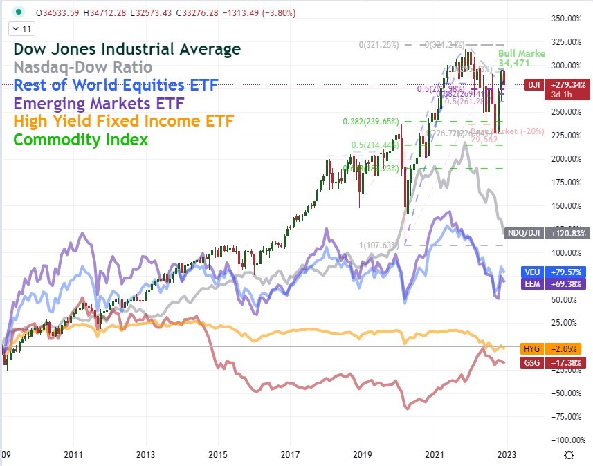
Chart Created by John Kicklighter
For most traders, making a relationship matrix that they track for sentiment is probably too complex and/or inconvenient to pursue. Yet, I believe it is worth the investment of time given the bigger picture it can offer on the markets we are navigating. Nevertheless, if the singular US index is about the limit to your scope, I would add another fairly accessible measure to consider for some deeper insight. When it comes to the alignment of many unrelated assets, it can signal the degree of intensity with which markets are moving under the power of risk appetite; but there is also blunting in the ebb and flow of this influence depending on the differences of the different variables. To help provide more insight on targeted sentiment by reducing the influence of ‘US’ or ‘equity’ specific themes, I like to compare top-level US indices. My preference for this is looking at the ratio of the Nasdaq 100 relative to the Dow Jones Industrial Average.
What does the Nasdaq represent within the ecosystem of US equities? The index is made up of the largest non-financial companies on the Nasdaq stock exchange and is ultimately heavily weighted towards technology. In that capacity it focuses on firms that tend to have a stronger connection to the underlying health of the economy with faster gains in revenue and share prices when conditions are improving. At the same time, they tend to lose ground more dramatically in the reverse circumstances. For 2022, the Nasdaq 100 is down approximately -34 percent and is standing just above its 5-year (60 month) moving average and the 38.2 percent Fibonacci of the low in 2022 to last year’s high.
Chart of Nasdaq 100 with 200-Day SMA, 60-Month SMA, Monthly ROC and 12-Month ATR (Monthly)
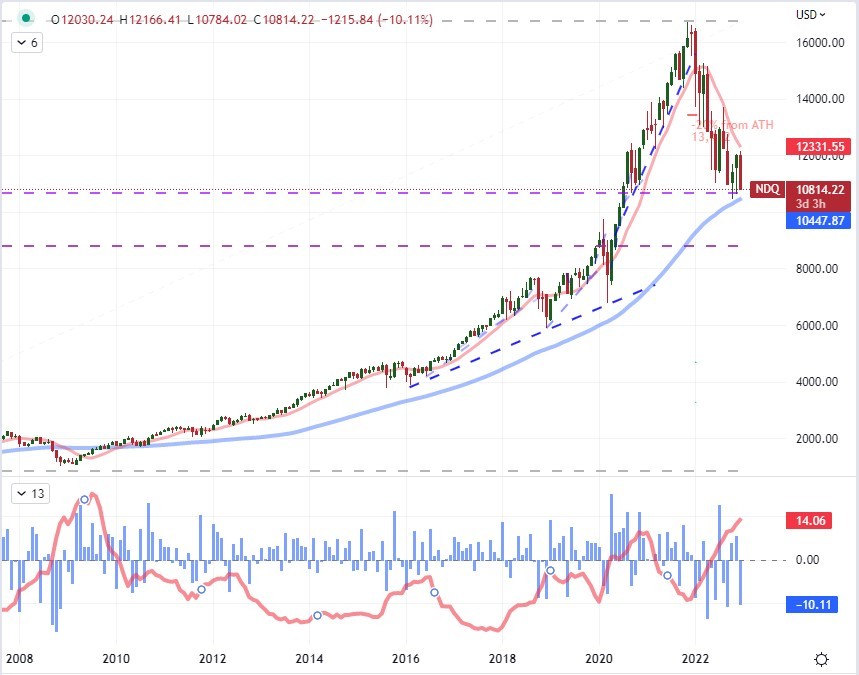
Chart Created on Tradingview Platform
In contrast to the Nasdaq’s focus on large market cap stocks in the tech industry more prone to the ‘boom and bust’ in economic cycles, the Dow Jones Industrial Average is the index frequently referred to as the ‘blue chip’ or ‘value’ index. The 137 year old index is comprised of the 30 of the largest companies in the United States overall with a mix of industries represented. The measure is more reserved in its climbs in strong periods and tends to be less dramatic when the tide ebbs. For context, the Dow is looking to end 2022 down less than -9 percent from the previous year’s close after reversing a technical ‘bear market’ (20 percent correction from all time highs) back into a ‘bull market’ (20 percent gain from significant structural lows).
| Change in | Longs | Shorts | OI |
| Daily | -18% | 18% | 7% |
| Weekly | -19% | 14% | 4% |
Chart of Dow with 200-Day SMA, 60-Month SMA, Monthly ROC and 12-Month ATR (Monthly)
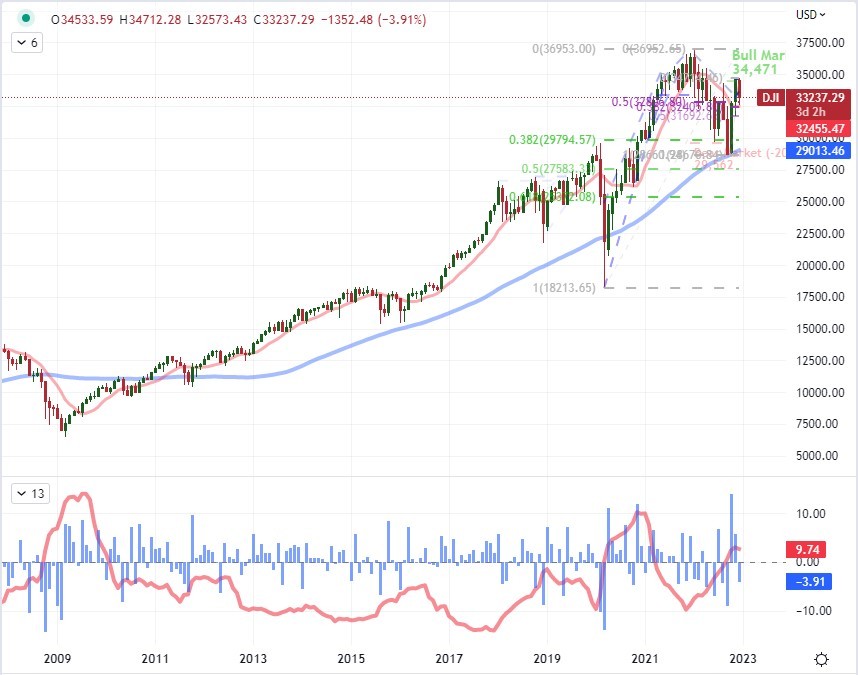
Chart Created on Tradingview Platform
Both the Nasdaq and the Dow represent very liquid equity measures for the United States, but there is a core disparity in how investors and managers treat the two measures. Therefore, I like to make a ratio of the indices to give me a perspective on underlying sentiment within one of the deepest channels for speculative activity. Taking a look at the Nasdaq-Dow ratio below, there has been an approximate -28 percent drop in the relative performance of the two. This has pushed the ratio to its lowest levels since March 2020 through year’s end. That is the same period that we were in the midst of the pandemic crisis. Of course, during that period, there was severe ‘risk aversion’ followed by sharp ‘risk appetite’ fueled by the shutdown and then propped up by stimulus. Through it, we saw a consistent preference for Nasdaq.
Chart of Nasdaq-Dow Ratio with 200-Day, 60-Month SMA, Monthly ROC and 12-Month ATR (Monthly)
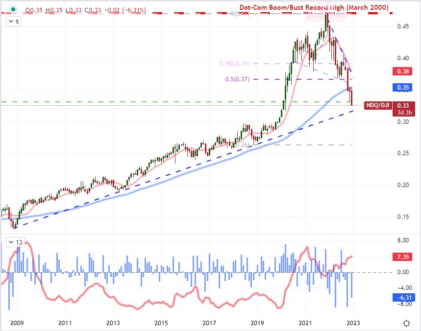
Chart Created on Tradingview Platform
In the current phase of retreat for the ratio, I think it is worth acknowledging the big picture turning point. It topped in November 2021 in the same vicinity as the ‘Dot Com’ boom-bust peak back in March 2000. There were certainly aspects of preference in technology companies in the past three years, but nothing like the rise of the internet age previously. The difference now is the allure of commanding market caps and speculative appetite.
Chart of Nasdaq-Dow Ratio with 200-Day and 60-Month SMAs (Monthly)
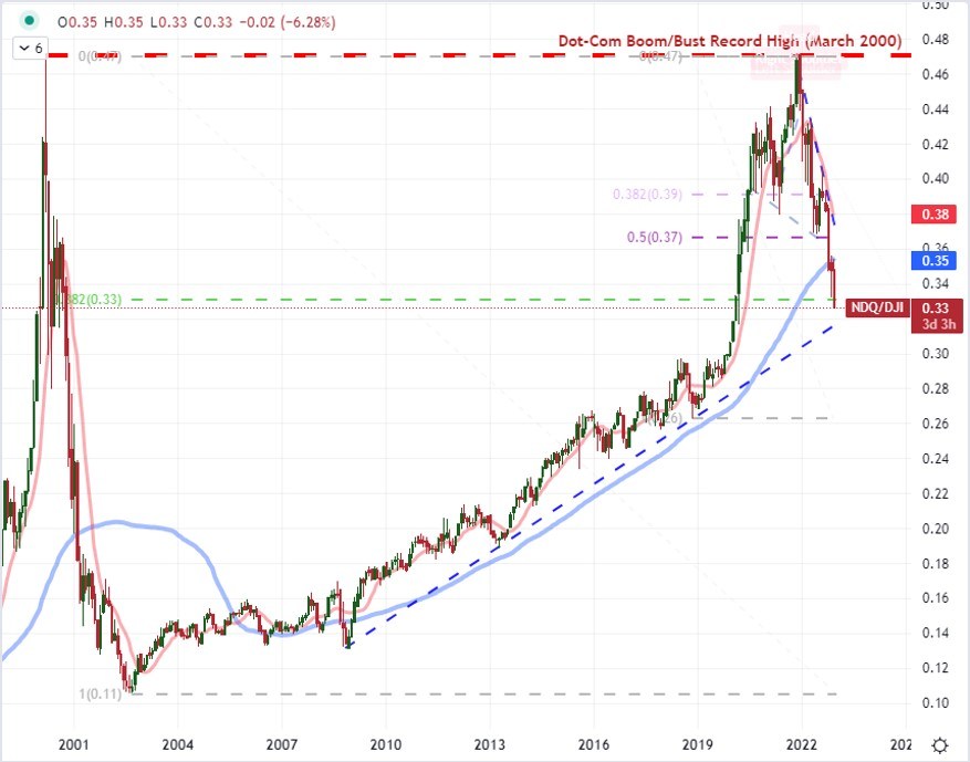
Chart Created on Tradingview Platform
Looking ahead into 2023, there are many fundamental themes to reflect upon, including tighter financial markets (higher interest rates), trade issues and recession fears. The technical bearings of the various benchmarks we follow – a few of which we have discussed here – are also unflattering. There are also seasonality factors to account for. Breaking it down by month, the January is historically tagged as a bullish month from the S&P 500’s perspective with moderate levels of volatility and volume. However, there are variations in the year-to-year measure of monthly performance. I also believe there are likely seasonal conditions at play that fall outside the calendar month measures. Economic cycles, liquidity cycles and the influx of a new speculative generation (via meme stocks and crypto) are likely playing out. Where do you think we are at in those different cycles?
Chart of Average Monthly Performance for S&P 500, Volume and VIX Volatility
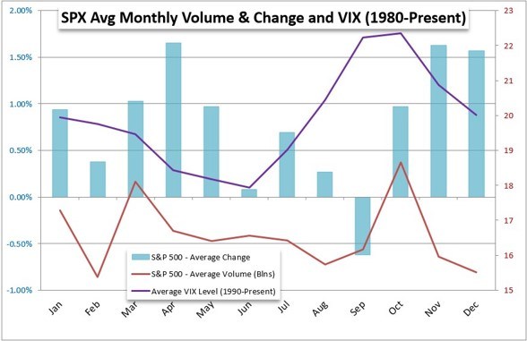
Chart Created by John Kicklighter