


S&P 500, USD, Gold Price Analysis
- It was a pullback type of morning as trends in all of the USD, Gold and the S&P 500 have posted counter-trend moves.
- While many appear to be harboring expectations for equities to crash, the S&P 500 remains about 44% off of the March lows; and this morning’s pullback has so far found support at a key area on the chart.
- The x-factor here appears to be the Fed, as Jerome Powell had previously remarked that there’s ‘no limit’ to what the bank can do with the liquidity programs available to them.
New Quarter, New Questions
We’re now just over a week into Q3 and already some items of interest have begun to show around global markets. While headlines remain a mess with heavy politicization of the coronavirus, which can bring a massive impact onto market expectations, the trends across risk markets have remained fairly clear. Stocks have been very strong since the March lows, and given the expectation for the FOMC to remain very loose and passive in the effort of offsetting coronavirus-slowdown risks, Gold prices have driven up to a fresh eight-year-high.
Perhaps surprisingly, the USD has shown a general proclivity to range over the past few months, with the bulk of Q2 spent in mean reversion and, so far that’s been the name of the game in early Q3 trade. To be sure, there was a quick spurt of trend in late-May and early-June; but after DXY ran into the key support zone running from 95.86-96.05, sellers were thwarted and the currency moved into a range bound state that held through the end of Q2 and, so far, the open of Q3.
US Dollar Four-Hour Price Chart
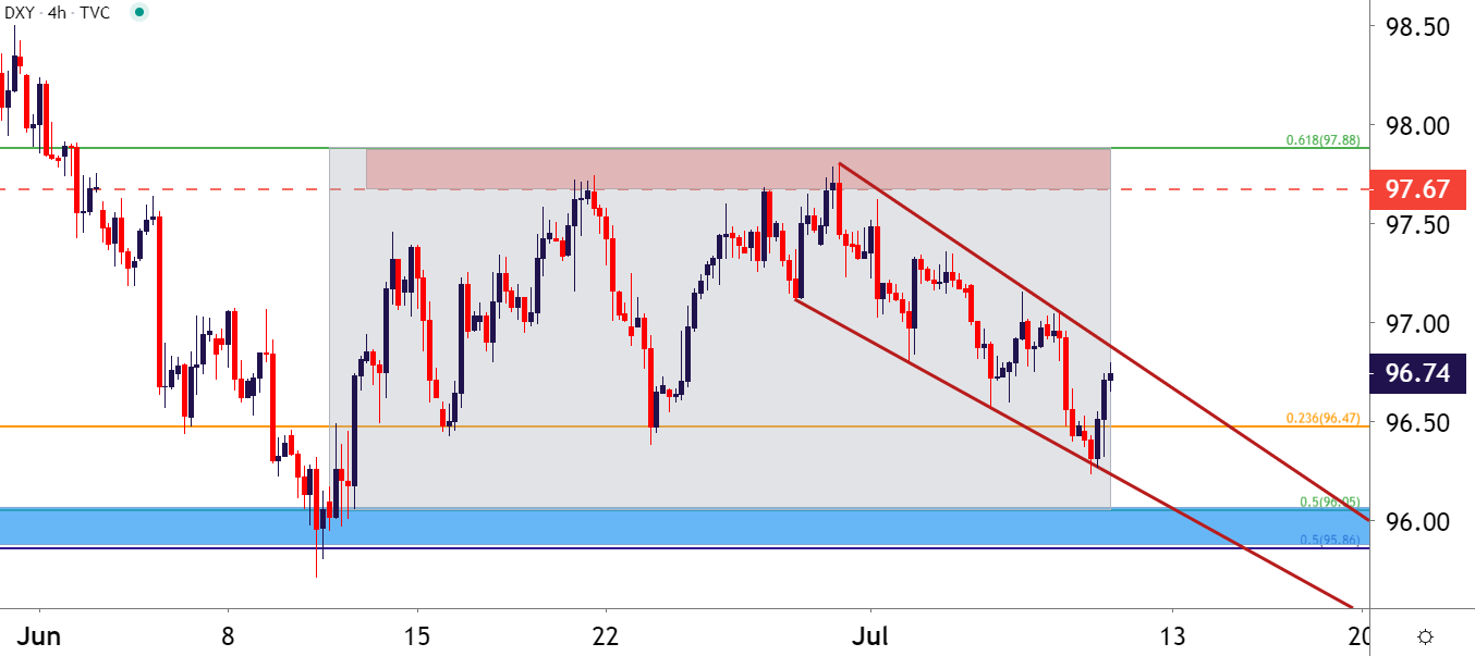
Chart prepared by James Stanley; USD, DXY on Tradingview
The importance of the support zone around 95.86-96.05 cannot be understated: This is a confluent support zone that helped to set the low for the final ten months of 2019. There were three separate tests in this area, each of which saw buyers come into the equation, and those took place in February, March and June.

This zone even helped to hold the early-March lows, as USD was selling-off with aggression as the coronavirus was getting priced-into markets. There were two days in which price action tested below this key zone of confluence, but buyers quickly brought the currency back-above as the USD rallied by 8.8% in a ten-day-span.
US Dollar Weekly Chart
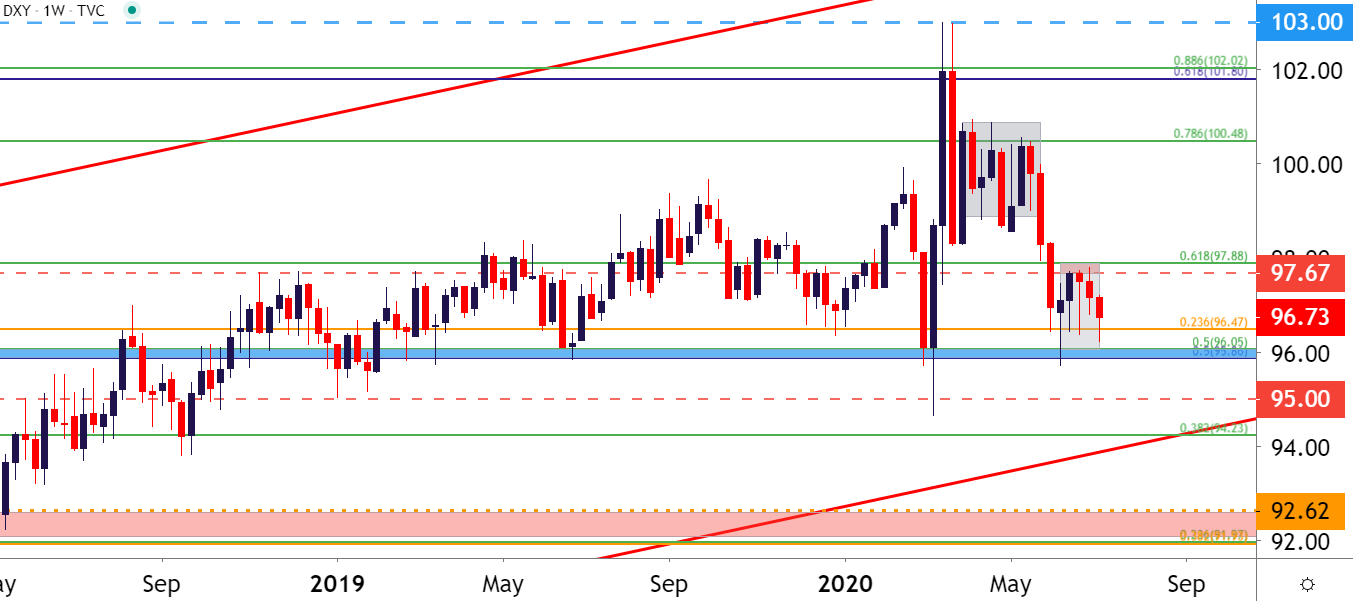
Chart prepared by James Stanley; USD, DXY on Tradingview
S&P 500 Pulls Back, Finds Support at Key Zone
I want to address this up front because I’ve already seen it said on social media regarding this morning’s equity pullback. Some have called this a ‘crash’ in the market, with the S&P 500 pulling back to the 3110-3115 area on the chart. And there’s a lot of pessimism out there, as some of those coronavirus-related headlines look pretty dire and could be projected to produce some element of disaster down-the-road. And sure, that might happen; but as of right now, there’s little evidence to suggest that it’s anything more than a possibility as the S&P 500 is currently up by around 44% from the March lows.

And while this definitely does not preclude the potential for a trend change, evidence simply does not exist yet that this is the case, as higher-low support has thus far helped to hold the lows.
S&P 500 Daily Price Chart
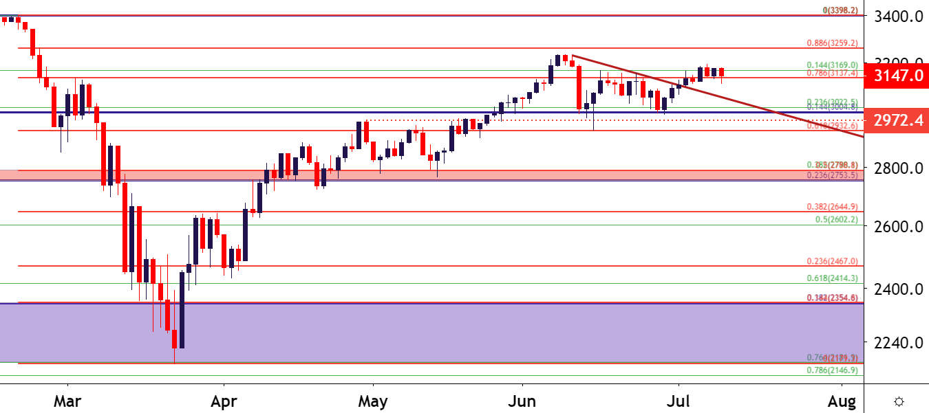
Chart prepared by James Stanley; SPX500 on Tradingview
So is this some type of ‘fake rally’ that’s merely waiting for sellers to re-take control; just waiting for the underlying fundamentals to reflect that pessimism that’s so widespread throughout the world right now? After all, earnings season is around-the-corner and maybe that’s when this theme finally shows up?
Well, let’s just identify the facts so that we can separate the opinions. That 44% number is a fact. And another fact is that we’re in fairly uncharted territory, the whole dealing with a global pandemic thing; there’s not really a requisite model from which we can draw inferences, so we’re swimming in the dark here, to a degree.
But – at what point does the stock market represent the underlying economy? There seems to be a lot of confusion around this, especially right now. The stock market, at least as I learned it, is not supposed to be thought of as a current representation of present-day fundamentals: Stock prices are, instead, thought to be the net present value of future forecasted cash flows. Emphasis on the ‘forecasted’ part of that statement. So – stock prices are supposed to reflect expectations, not avoid them in the effort of just focusing on the here and now, the pessimism that’s showing in the headlines to create a darker picture of today.
So, given that disconnect, the potential for continually deteriorating fundamentals, whether that be in employment, inflation or even an individual company’s earnings – even as stock prices are rising – would suggest that something else is at work. And that something else appears to be Central Bank accommodation. And at this point, there’s no sign that the Fed is going to willingly let up, so expecting another major correction would appear to be aligned with either the expectation for the FOMC to lose control – or for coronavirus to produce such an outsized negative response in the coming months that even the most pessimistic of models and forecasts is surprised to the downside. These are both possibilities that I do not want to summarily dismiss, especially the coronavirus one as noted above regarding the whole uncharted territory scenario; but at this point there’s little evidence to suggest that either is yet taking shape.
But – back to some facts. Monday of this week saw the S&P 500 push up to a fresh near-term-high. Buyers have taken a back seat since, allowing for price action to retrace down to a key area of support, taken from around the 3110-3117 level on the chart. And so far, that has held. So, sure, something may change tomorrow or next week – but, at least for now, stock prices have held on to that higher-low support.
S&P 500 Four-Hour Price Chart
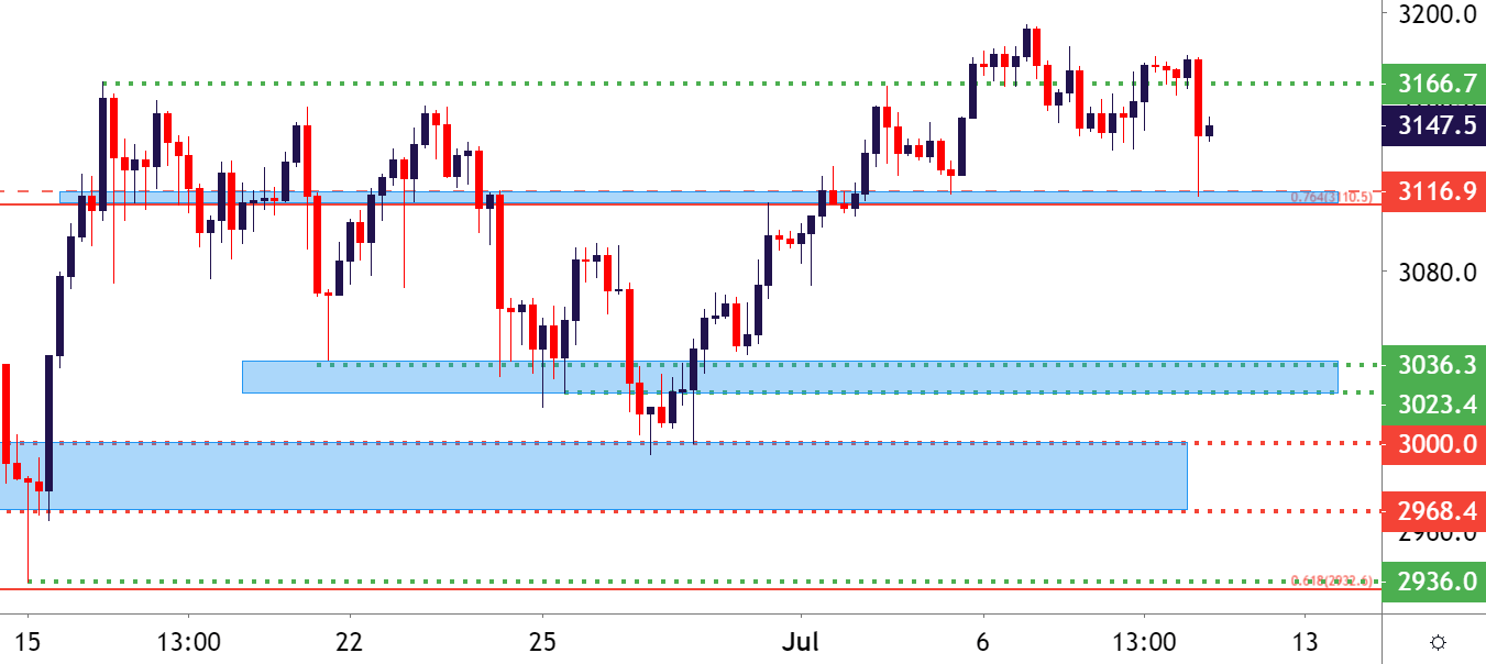
Chart prepared by James Stanley; SPX500 on Tradingview
Gold Pulls Back from Fresh Eight-Year-Highs
A little more clear, Gold prices have remained in trend for some time now and yesterday saw the yellow metal push up to a fresh eight-year-high, crossing the 1800 level in the process. I had written about the move as that Gold breakout was beginning to find resistance; highlighting support potential at a key long-term zone on the chart running from 1796-1800. That support came into play earlier today, at which point bulls responded, and prices have so far held the lows in this vicinity.
Gold Four-Hour Price Chart
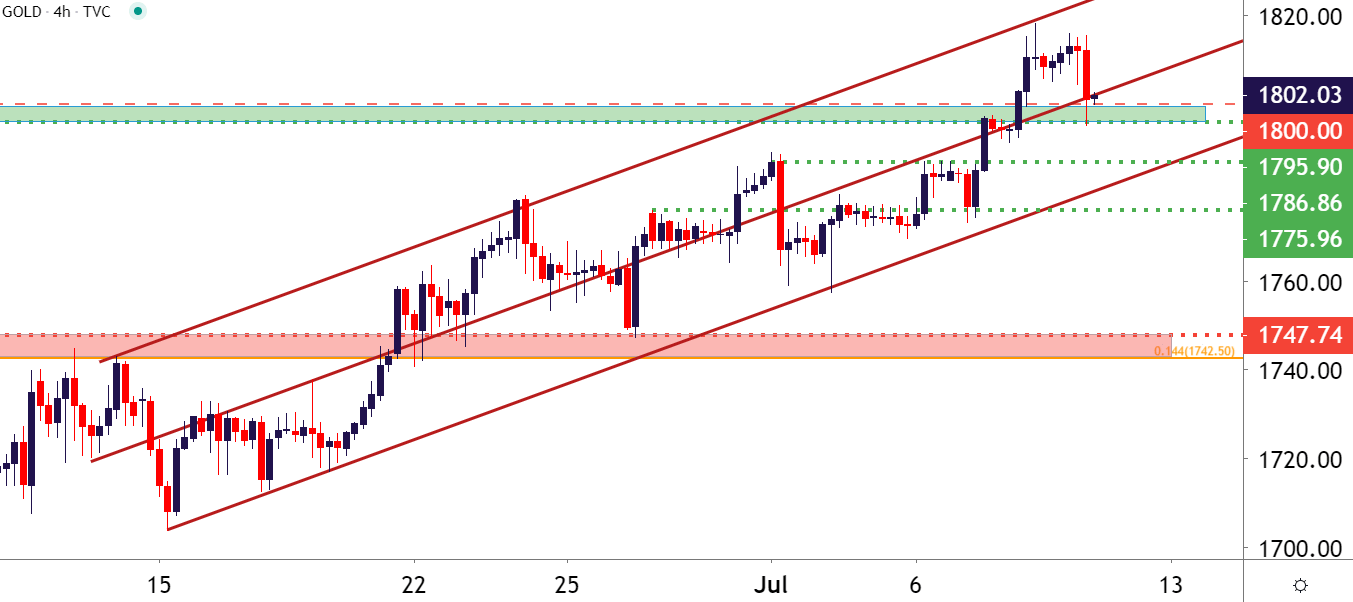
Chart prepared by James Stanley; Gold on Tradingview
Gold as the X-Factor
Going back to that tug-of-war between optimism and pessimism looked at above, Gold appears to be of significant importance here as this is potentially one of the proxies for reading that FOMC dovishness. As the Fed responds to pressure, that generally entails some element of additional liquidity, such as what was discussed in the Central Bank intervention article in the DailyFX Education Course. That additional liquidity can be thought of as a form of monetary debasement, somewhat resembling the theme that took place in Gold from the 2008 lows up to the 2011 high, when Gold prices gained approximately 282% in a little under three years.
There’s already been the build of some wild expectations here, with one bank setting their forecast as high as $3000, which, curiously, begs the question of how one projects such a price when there’s literally never been anything similar taking place. Nonetheless, strength in Gold has been a theme in markets since the opening days of Q4, 2018, when Jerome Powell said that the Fed was ‘a long way off’ from the neutral rate, implying that the FOMC had plans for more rate hikes in 2019 and beyond.
That, of course, didn’t happen: Instead we saw the bank go into a cutting cycle last year and that further helped to drive Gold prices higher. That cutting cycle hit fever pitch in early-March when the Fed yanked rates to the lower-bound while announcing a trove of additional liquidity measures. And after an initial scare through global markets, investors got back on the bid and began to push Gold prices back up to fresh highs.
So, this creates an element of relation between these very key three assets of Gold, Stocks and the US Dollar; with focus on the Fed for how they continue to manage expectations as the world continues into the abyss of the novel coronavirus.
Gold Weekly Price Chart
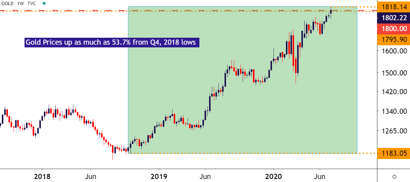
Chart prepared by James Stanley; Gold on Tradingview
--- Written by James Stanley, Strategist for DailyFX.com
Contact and follow James on Twitter: @JStanleyFX