


Talking Points:
- The S&P and Dow 30 led US equities to their worst single-day loss in since August 2011
- Selling pressure that started last week is increasingly tapping animalistic investor fears
- Momentum in global risk aversion means watching to see if European and Asia markets catch the flu
What makes for a 'great' trader? Strategy is important but there are many ways we can analyze to good trades. The most important limitations and advances are found in our own psychology. Download the DailyFX Building Confidence in Trading and Traits of Successful Traders guides to learn how to set your course from the beginning.
The sense of fear was hard to miss in the market’s this past session. Last week’s market performance introduced a wide and intense selloff that scored a technical break lower for the major US equity indexes and closed out the worst five-day slide in approximately 13 months. The stumble certainly sparked a high level of concern given the depths of complacency that had calcified in the financial system for months and years. A good example of the general state of undeserved comfort that had seized the market was the run of 113 consecutive trading days for which the S&P 500 did not register a 1 percent or greater decline – the longest such series since 1966.
The Pain Intensifies
The open for US equities Monday was already starting on the wrong foot. With global shares steeped in red through Asian and European hours preceding it, the bearish intent was already staged for the open for trade in New York. Indeed the day started with a 0.76 percent gap lower than Friday’s close for the S&P 500 – the biggest opening bearish gap for the benchmark index since 2011.
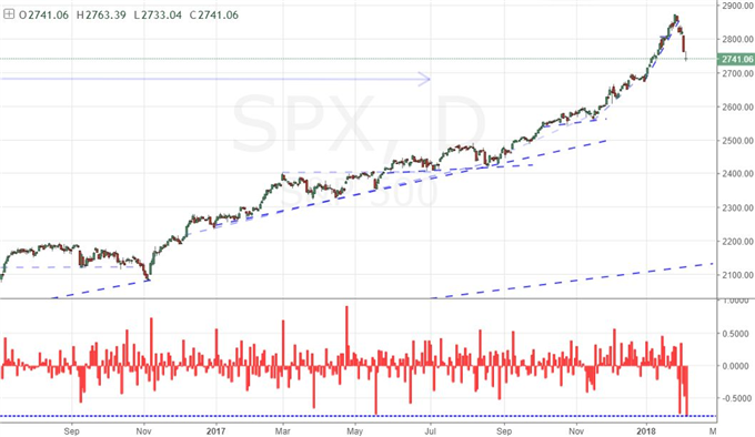
Chart created using TradingView
Looking more to the course of a turn rather than a single day’s performance, the aggregate gaps of the past five trading days (equivalent to one trading week) was the largest percentage loss of ground for the S&P 500 on modern record. This speaks to heavy selling pressure overnight when the pause in liquidity has recently done more to let rational minds gather their wits and helps stabilize the panicked moves. That rationality has yet to solidify.
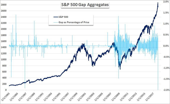
Chart created by John Kicklighter using Data from Bloomberg
The intensity of Monday’s tumble in ‘risk’ leading assets is best appreciated when looking at an intraday chart of a liquid asset that has afterhours trade. Below, the hourly chart of the S&P 500 eminis futures contrast shows how the fear escalated to extreme levels in the closing hours of the session and even into the early afterhours. On the spot index with an official close, the S&P 500 lose 4.1 percent on the day for the worst tumble since August 2011. However, when evaluating the day for the futures asset into the afterhours low, the day’s plunge totaled nearly 5.6 percent.
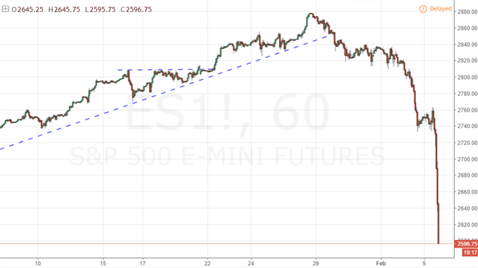
Chart created using TradingView
Scale and Historical Reference
To give a sense of scale to the S&P 500’s losses, the chart below shows the daily chart with a one-day rate of change below. The intensity of the move is unmistakable but so too is the intent. Given the depth of the slide over the past week with the intensity of Monday’s session, this is not a simple ‘buy the dip’ proposition. Recovery will require more conviction than a small band of speculators in a particularly thin and complacent market.
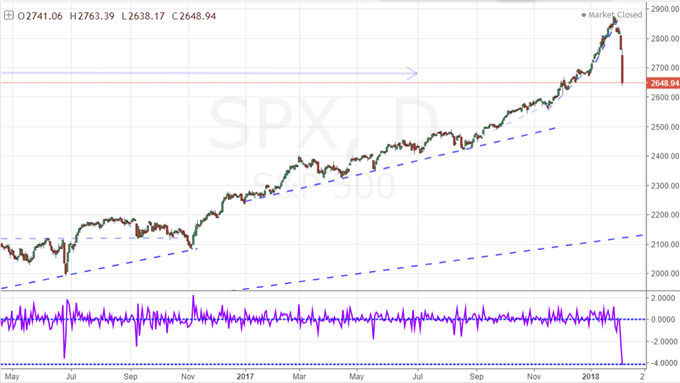
Chart created using TradingView
With more historical reference, we recognize that this was the largest single daily loss since 2011 – the last time the S&P 500 had last experienced a technical bear market (defined by a 20 percent or greater retreat from highs). It is naturally appealing to try to draw immediate examples from history and extrapolate them to present day in order to establish a straightforward and quantitative trading strategy. Yet, that is a perilous endeavor. We have to look beyond statistics, technical levels and the sentiment of the past decade. Years of one-sided and global risk appetite have distorted markets from their traditional fundamental moorings. Sentiment is the primary unit of value and that makes for very fluid conviction when optimism sours.
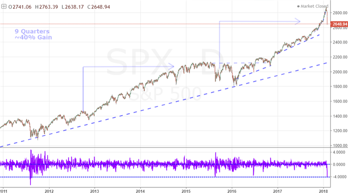
Chart created using TradingView
Next Steps for Evaluating the Market
If your predilection is for technical analysis, there are many milestones on the way down that will serve as critical make-or-break levels. Trendlines, Fibonacci levels, and even the psychological appeal of large round numbers will be monitored closely. Personally, I will be watching the standard, simple moving averages – 50-day, 100-day and 200-day. With Monday’s plunge, we have fallen below the 50-day for the first time in 108 trading days – a first serious fissure in momentum. The S&P 500 is quickly approaching its 100-day average which has not been breached in 308 trading days which is the longest record since July 1996. Meanwhile, the 405 days above the 200 day average is only a 3.5 year record.
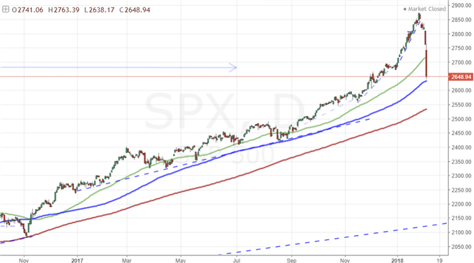
Chart created using TradingView
Related risk exposure and efforts to hedge is another measure of intent. The VIX volatility index below surged over 100 percent this past session, but it did so from a remarkably low level – though not as low as the sub-10 that we saw so often in the second half of 2017. There are good debates over whether this traditional ‘fear index’ gives us the same true assessment of our market’s health that it had in previous years. Securitization has blended with complacency to generate serious distortions on both extremes.
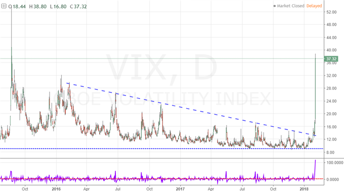
Chart created using TradingView
Breadth is the true measure of how pervasive the market unwind can/will become. Individual assets or regions can suffer remarkable losses due to localized problems that never escalate to a global influence. While such events can be destructive for certain markets, they often burn themselves out. It is when the selling begins not in a particular asset or region but rather in sentiment itself that global bear trends can route the markets. To gauge how universal the risk aversion sentiment is, correlation and momentum between a variety of otherwise unique assets works well.
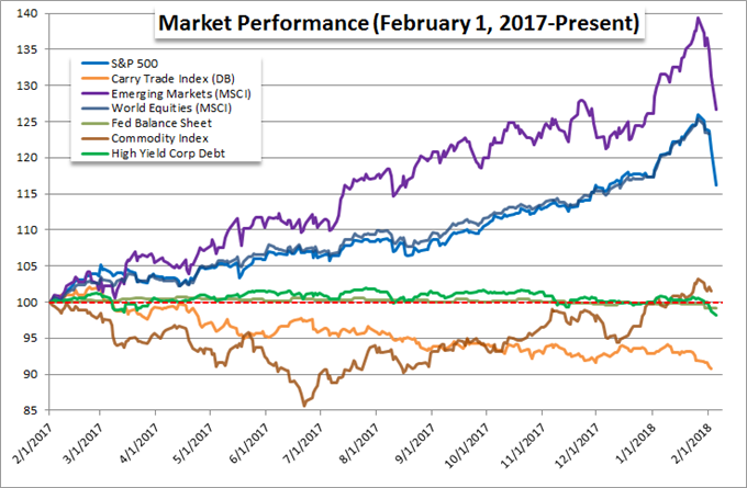
Chart created by John Kicklighter using Data from Bloomberg
To see sentiment in another way, I have added my ‘risk severity curve’ below. When risk aversion escalates, the market impact it has intensifies to the point of systemic influence and troubling momentum. Along the way, there are often milestones that signal we are reaching such degrees of intensity. Correlation is a starting point, adding intensity to the trends of the various assets furthers it, but evidence of liquidity gaps is when the situation grows serious. We are still at the cusp of that level of severity, but it is not a wise time to be idle.
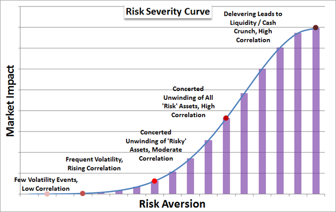
Chart created by John Kicklighter
One Day at a Time
While we are seeing the greatest risk to the markets and their stability versus any point in the past two-and-a-half years, we should still monitor the progression of the global contagion a session at a time. Below is a relative performance chart for the benchmark equity indexes from the US, UK, Germany and Japan below. With the intensity of the sell-off escalating sharply through the final hours of the New York trade, the next stage to fostering panic would be a spread into similar panicked selling through the Asia session hours in regions like Japan, China and South Korea – all carrying a considerable degree of speculative sway. If it then carries into European markets, we will have ‘caught up’, to the US pain and then true intent will be under review.
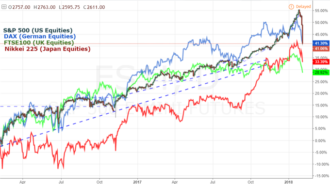
Chart created using TradingView
To receive John’s analysis directly via email, please SIGN UP HERE