


British Pound Vs US Dollar, Euro, Australian Dollar – Price Setups:
- GBP/USD has pulled back from key resistance.
- GBP/AUD risks a minor retreat from overbought conditions.
- A minor double bottom in EUR/GBP.

The British pound looks set to retreat slightly against its peers following evidence that price pressures in the UK are finally moderating from elevated levels.
Data showed inflation slowed to 7.9% on-year in June, Vs 8.2% expected and 8.7% in May. Core inflation eased to 6.9% on-year from 7.1% in May. As a result, the Bank of England’s terminal benchmark rate expectations have scaled back to around 5.8% by the end of the year, from slightly over 6% on Tuesday, and 5% currently.
Also, this probably means BOE will move by 25 basis points at its next meeting in August rather than 50 basis points. But the bias is still for higher rates as headline inflation is the highest amongst G7 economies, and well above BOE’s 2% target, keeping the downside in GBP supported, both from absolute (level of terminal interest rates) and relative (potential for more tightening) monetary policy perspective in comparison with some of its peers.
GBP/USD Weekly Chart
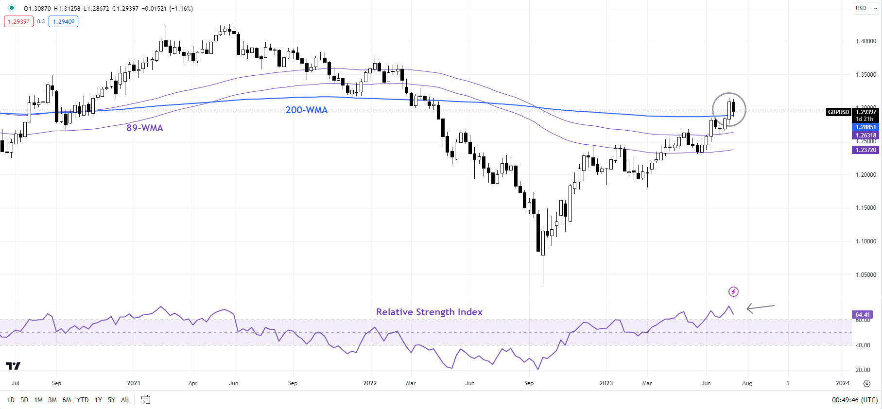
Chart Created by Manish Jaradi Using TradingView
GBP/USD: Bullish pressure is easing in the short term
From a trend perspective, GBP/USD broader trend remains up, as the colour-coded daily candlestick charts show. However, overbought conditions coupled with stretched speculative long positioning (around the highest level since 2014) raise the risk of some consolidation given the pair has run into stiff resistance on the 200-week moving average.
GBP/USD Daily Chart
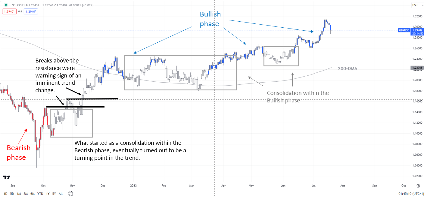
Chart Created by Manish Jaradi Using TradingView; Notes at the bottom of the page
For now, though, GBP/USD has quite a strong cushion on the 89-period moving average, roughly coinciding with an uptrend line from the end of June. Any break below would confirm that the short-term upward pressure had faded, potentially opening the gates toward the end-June low of 1.2600.
GBP/USD 240-minute Chart
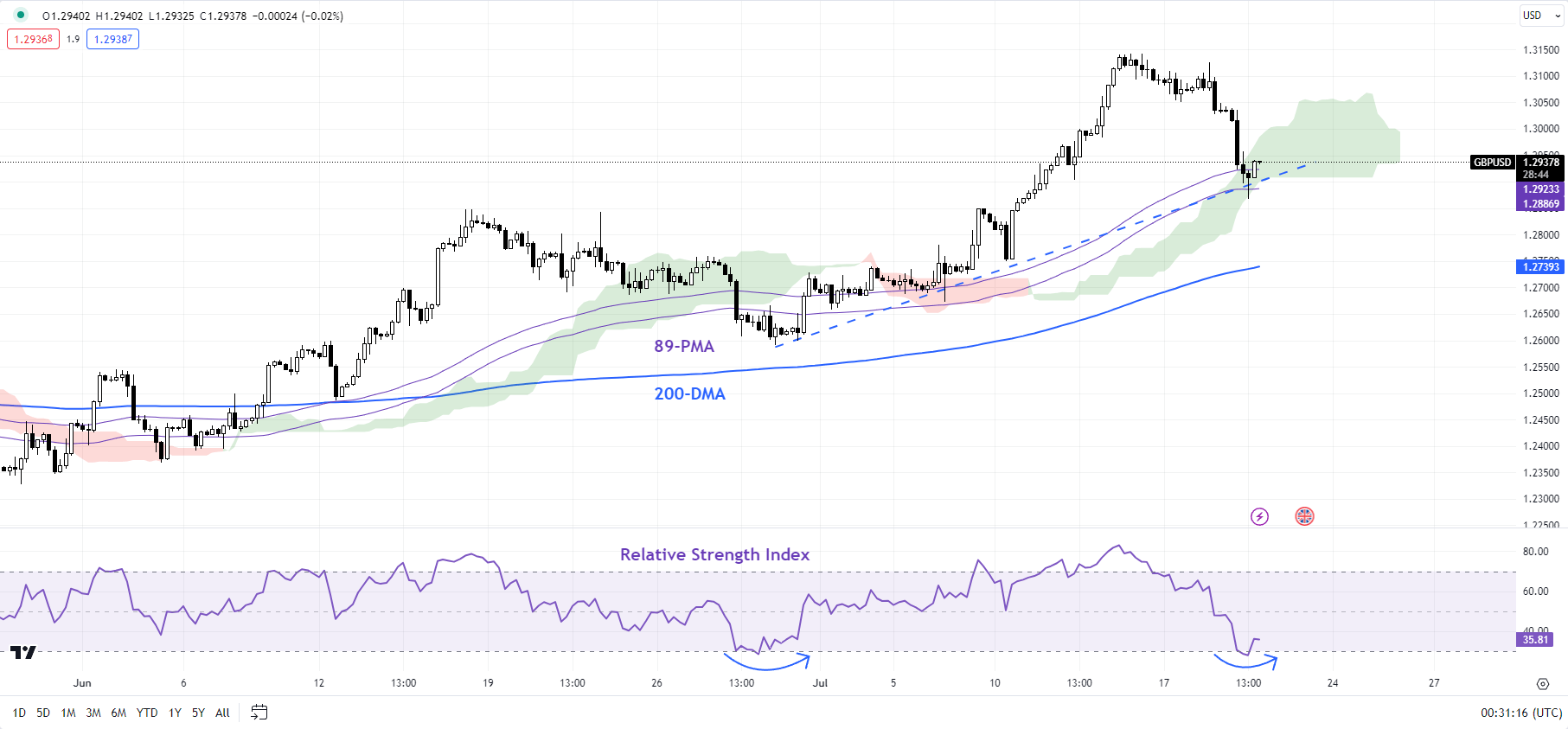
Chart Created by Manish Jaradi Using TradingView
Beyond the daily timeframe, from a medium-term perspective, the rise this month to a one-year high in May confirmed the higher-tops-higher-bottom sequence since late 2022, leaving open the door for some medium-term gains. (see “British Pound Buoyant Ahead of BOE: How Much More Upside?”, published May 8).
EUR/GBP Daily Chart
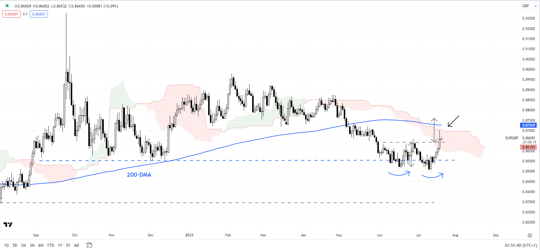
Chart Created Using TradingView
EUR/GBP: Minor double-bottom triggers
EUR/GBP’s rise above the end-June high of 0.8635 has triggered a minor double bottom (the June low and the early-July low) – as highlighted in the previous update. See “British Pound Ahead of UK CPI: GBP/USD, EUR/GBP, GBP/JPY Price Action,” July 18. The bullish break has opened the door toward stiff resistance on the 200-day moving average (now at about 0.8730). Earlier, EUR/GBP’s decline stalled in recent weeks around key support at the December low of 0.8545.
GBP/AUD Daily Chart
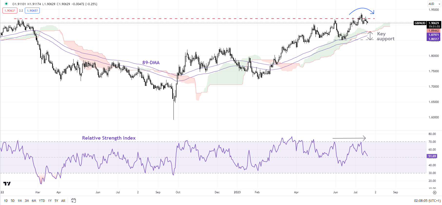
Chart Created Using TradingView
GBP/AUD: Upward momentum is fading for now
A negative momentum divergence (rising price associated with a stalling in the 14-day Relative Strength Index) suggests GBP/AUD’s rally is losing steam as it tests a vital ceiling on a horizontal trendline from 2021, at about 1.9200. Chances are the cross could consolidate with a downward bias in the near term. Any break below the immediate cushion around the June low of 1.8500 would indicate that the short-term upward pressure had faded, potentially opening the door toward the 200-day moving average (at about 1.8230).
Note: The above colour-coded chart(s) is(are) based on trending/momentum indicators to minimize subjective biases in trend identification. It is an attempt to segregate bullish Vs bearish phases, and consolidation within a trend Vs reversal of a trend. Blue candles represent a Bullish phase. Red candles represent a Bearish phase. Grey candles serve as Consolidation phases (within a Bullish or a Bearish phase), but sometimes they tend to form at the end of a trend. Candle colors are not predictive – they merely state what the current trend is. Indeed, the candle color can change in the next bar. False patterns can occur around the 200-period moving average, around a support/resistance, and/or in a sideways/choppy market. The author does not guarantee the accuracy of the information. Past performance is not indicative of future performance. Users of the information do so at their own risk.

--- Written by Manish Jaradi, Strategist for DailyFX.com
--- Contact and follow Jaradi on Twitter: @JaradiManish