


S&P 500, Dollar, Australian Dollar Talking Points:
- Risk appetite continued to show a dislocated advance with the S&P 500 and Nasdaq hitting a record high while so many other benchmarks floundered on Sept 1
- EURUSD pulled back from 1.20 but is the Dollar truly putting in a recovery following the ISM manufacturing update and talk of long-delayed US stimulus?
- The Australian Dollar remains in focus ahead with the RBA passing without further break higher while Aussie GDP and China trade troubles highlighting AUDUSD and EURAUD
Risk Appetite Doesn’t Take Off on September 1…No Surprise
We have closed out the first full trading day of September, which is a transition for those that are monitoring seasonal norms…at least for those looking at them in facile terms. It is true that the month of August is the most reserved period of the calendar year on average for the S&P 500 and the subsequent month sees a swell in volatility and the only month of averaged losses in the year, but this general activity shift doesn’t happen at the drop of a dime. Liquidity is a key component of the transition. This past session, the broad US index continued its slow advanced higher helped by stimulus chatter through the afternoon hours of the New York session. Yet, there remains a notable lack of pace to this climb.
Learn more about the three types of general Forex market analysis in our education section.
| Change in | Longs | Shorts | OI |
| Daily | 6% | -5% | 1% |
| Weekly | 7% | -10% | -2% |
Chart of S&P 500 with 20-Day Moving Average and ATR (Daily)
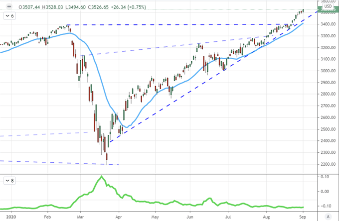
Chart Created on Tradingview Platform
Looking to risk barometers in other regions and other asset classes, there remains little-to-no conformity in speculative appetite. From Germany’s DAX to the UK’s FTSE 100 to Japan’s Nikkei 225, the first day of the new month was widely disappointing. For non-equity measures like emerging markets, high-yield fixed income and carry trades; the backdrop was much the same. Even within the top performing US stock market, the outperformance of Tesla, the FAANG group or the Nasdaq (relative even to the S&P 500) speaks volumes as to the setting in speculative appetite. It an appetite for momentum rather than value.
Chart of Risk Assets Performance Relative to Annual Performance (Daily)
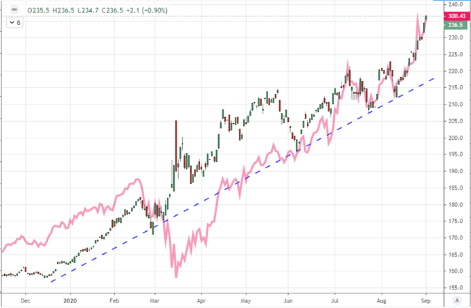
Chart Created by John Kicklighter with Data from Bloomberg
Yet, as the slow-burn speculative stretch continues, I remain cognizant that liquidity frequently does recover this month as does volatility. That is my principal concern rather than the statistical averaging for the only month of SPX losses of the calendar year. Market conditions hold a material sway over whether technical levels will trigger significant response or schedule event risk seriously move the needle. We have some remarkable cannon fodder to watch out for this week – NFPs on Friday and 92 on the Dollar – but without a market to transmit surprise, the response is likely to be clipped.

Chart of S&P 500 and VIX Seasonal Performance (Monthly)
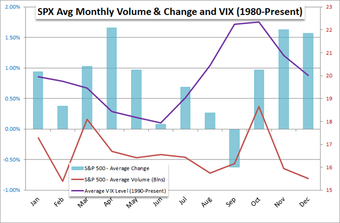
Chart Created by John Kicklighter with Data from Bloomberg
The Dollar and the Stimulus Question
For event risk this past session, the most noteworthy update was perhaps the US ISM manufacturing report. Advancing to a near-two-year high seems to fall squarely in the general course of optimism that has seen speculative representative – if not conviction – for a ‘V-shaped’ recovery. The real update on health for the world’s largest economy comes on Thursday in the service sector update as that account for approximately three-quarters of output. In the meantime, another matter seemed to be in play: stimulus. External support is a critical feature of our current landscape with massive central bank and government programs in place to maintain the peace. Yet the infusions can only go on so long.
Chart of S&P 500 and Rolling Three-Month Rate of Change on Fed Balance Sheet
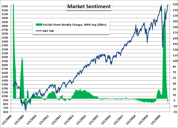
Chart Created by John Kicklighter with Data from Bloomberg
Notably, the United States government has yet to offer up the replacement of the CARES Act which expired on July 31st. Speculative focus seemed to do what it has done best these past years, downplayed the implications of that necessary pandemic offset, but the Treasury Secretary Mnuchin’s mentions of the gap today remind us of the risk run in keep back an economic support with growth still on an uneven footing. Meanwhile, the central bank’s part was roused when Fed Governor Lael Brainard suggested a shift back to active accommodation may be ahead. I can’t say I think of the US central bank as restrictive in its actions, but their pace of balance sheet expansion has eased recently.
Chart of Central Bank Monetary Policy Effectiveness
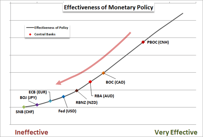
Chart Created by John Kicklighter
The risk going forward is that the world recognizes that central banks are running out of room to keep sentiment propped…they have already seen their way over economic activity in the rear view. Should the world’s policy authorities continue to act in concert to expand their efforts yet markets or - more concerningly, economic activity – fail to respond, there is significant speculative premium at risk of giving way.
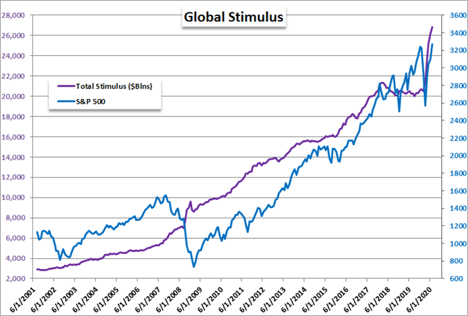
Chart Created by John Kicklighter with Data from Bloomberg
Where economic activity and stimulus upswing are concerned, however, there isn’t just a wholesale speculative sentiment consideration for which we need to account. There is also a relative assessment. While it does not exactly stand out as a tide change, the Dollar did ease back from a further break down this past session after the ISM report and stimulus talk. Keeping DXY above 92 and EURUSD below 1.20 is a technical achievement, but I think it has more to do with conditions that make it difficult to forge a trend rather than the heft of the chart levels or sway of the data.

Chart of EURUSD with 20-Day Moving Average and Wicks (Daily)
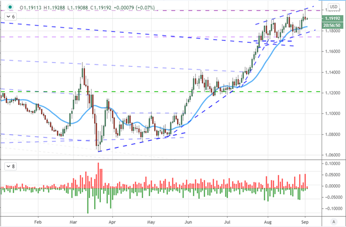
Chart Created on Tradingview Platform
The Australian Dollar Represents: Risk Trends; Growth Potential and Trade Wars
In the hierarchy of analytical weight, I give more credence to ‘market conditions’ than technicals or fundamentals. Ultimately, all three factors go into my assessment of markets, but whether a trendline break can find follow through or key event risk spurs a run often depends on liquidity and the alignment of speculative interests. At present, we are still looking for that consistency. That puts the likes of the Australian Dollar in an interesting position. Key technical levels are in view and high-profile event risk like the RBA decision and 2Q GDP are turning the screws. Yet, market conditions aren’t conducive to big moves. That is why I like EURAUD which has a range to consider before its serious break is up.
| Change in | Longs | Shorts | OI |
| Daily | -7% | 5% | -3% |
| Weekly | -23% | 50% | -8% |
Chart of EURAUD with 20-Week Moving Average (Daily)
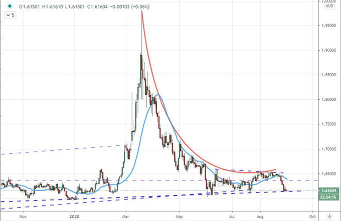
Chart Created on Tradingview Platform
Another factor of AUDUSD is trade wars. While much of the interest in this category is around USDCNH – which continues to tumble in a likely sign that Chinese authorities are attempting to signal relative economic strength to the United States – AUDUSD is another front for trade disputes. China halted imports of barley from Australia via the largest shipping company with another small upgrade in their dispute. That furthers the question of: how is the Aussie Dollar doing so well given the questions around risk trends, the RBA’s sharp undermining of the carry moniker, the local pandemic trends and now explicit growth risk in trade?
Chart of USDCNH with 20-Day Moving Average
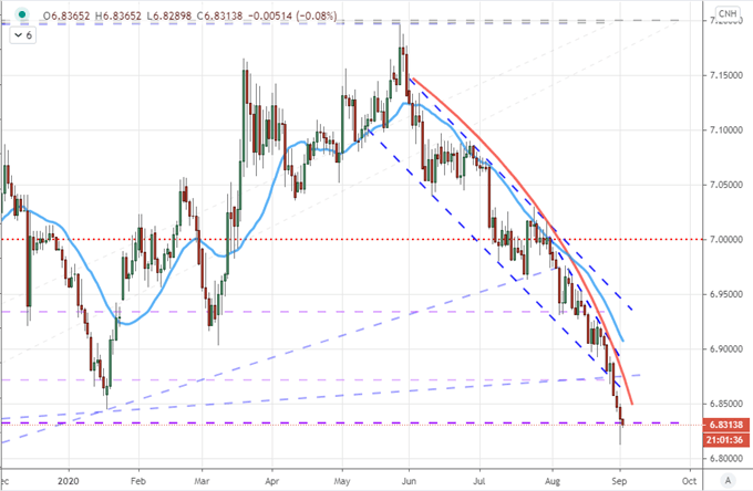
Chart Created on Tradingview Platform

If you want to download my Manic-Crisis calendar, you can find the updated file here.
.