


Talking Points:
- Traders usually look at lower time frame charts for shorter trades, investors review bigger pictures and provide stability to trends
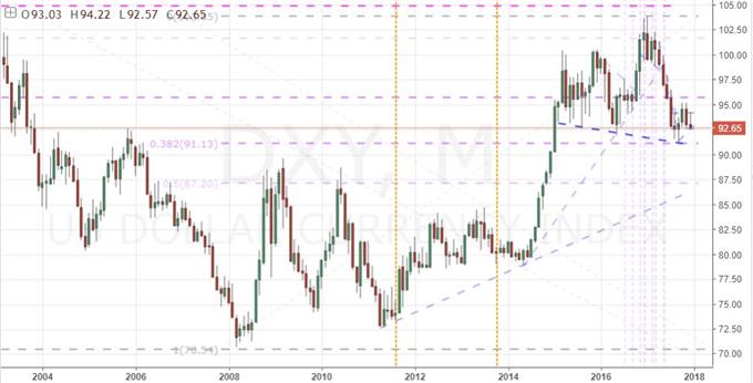
- Between Bitcoin and Dollar we find interesting technical progress on monthly charts, but the two are polar opposites for maturity
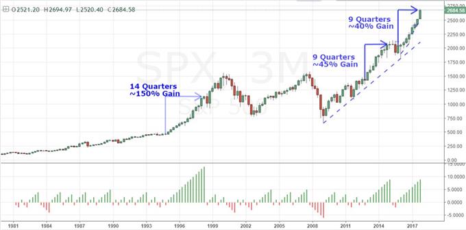
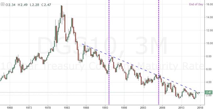
- The S&P 500's and Dow's ninth consecutive quarter rally is coming to a close, but their lifespan rests more with US 10-year yields
What makes for a 'great' trader? Strategy is important but there are many ways we can analyze to good trades. The most important limitations and advances are found in our own psychology. Download the DailyFX Building Confidence in Trading and Traits of Successful Traders guides to learn how to set your course from the beginning.
We are coming to the close of the week, month, quarter and year. This provides a great opportunity for the trader that usually keeps their charts set to daily candles and lower to appreciate what the bigger picture is telling us. There is a functional difference between those whose typical review of the charts and markets is more regular. By virtue of their frequency, they necessarily are taking positions that set up more quickly and are in turn expected to yield returns more quickly. That can be a month or more depending on when they jump into a new market phase and how developed their patience, but that would be the rare occassion. They are referred to as 'traders' for exactly that purpose. A market made up of these participants can produce strong trends in short durations, but stability is fleeting as the urge to profit take or cut a loss is strong.
In contrast, the 'investor' is a market participant that looks for value opportunities that can take months, quarters or years to be fully realized. When they reference charts, their scale is usually weekly, monthly or higher. Pull backs in the markets they trade are temporary and the result of 'noise' which will be readily overlooked in the pursuit of the bigger picture. The presence of this player provides much needed stability in trend. The greater their presence in the market as a percentage of active open interest, the more grounded and persistent the moves that evolve. Traders should take the time to puruse the investors' charts to ensure they appreciate the backdrop of the markets they intend to navigate. If we find that a popular 'buy the dip' effort in equities is increasingly the responsibility of traders and seeing an exodus of investors, we might find that the bounce on pull backs will grow smaller and smaller until they just don't happen at all.
Through the higher time frame charts we look at in this video, there are definitely some interesting technical stories to take away. But, the fundamental story they tell us about our markets is far more valuable. There is the monthly chart of Bitcoin which shows an incredible rally of unprecedented proportions. Yet, there is so little historical data to draw upon - a reminder of how fragile conviction in this indulgent charge may truly be. For contrast, we have the Dollar whose maturity and position in the traditional fiat world is the cryptocurrency's antithesis. Here, we see the tracking of standard fundamentals rather than the FOMO of speculation - and we also see a technical pressure building for a possible reversal. Key equity indexes show some of the most remarkable performances on the high scale charts. The S&P 500 and Dow have posted 9 consecutive quarters of rally to at least match the longest run in two decades for between 40 and 50 percent gains. Yet, the true foundation to all of these various market's unique performances can be found in 10-year Treasury yields. As unattractive as this market may be as a direct asset for most, it reflect what has been most important in performance to this point. We discuss the fundamentals in this big picture technical charts in today's Quick Take Video.
To receive John’s analysis directly via email, please SIGN UP HERE