


FINTWIT ANALYSIS
- U.S. dollar index (DXY) up over 1% this week.
- Natural Gas crunch intensifies.
- Tech stocks feel the pinch – NASDAQ
HOW FAR CAN THE DOLLAR GO?
The U.S. dollar has rallied this week putting strain on most USD crosses. Today sees the Dollar Index moving marginally lower as recent upside paused due to Q3 end flows resulted in dollar selling. The recent hawkish angle anticipated by the Fed has prompted the recent rise and may be under additional pressure as key high impact economic data is scheduled next week – see economic calendar below. The Non-Farm Payroll (NFP) report will play an important role as the U.S. labour market continues to disappoint which has led many analysts to be wary of stagflation (high inflation combined with slow economic growth).
NEXT WEEK’S U.S. ECONOMIC CALENDAR:
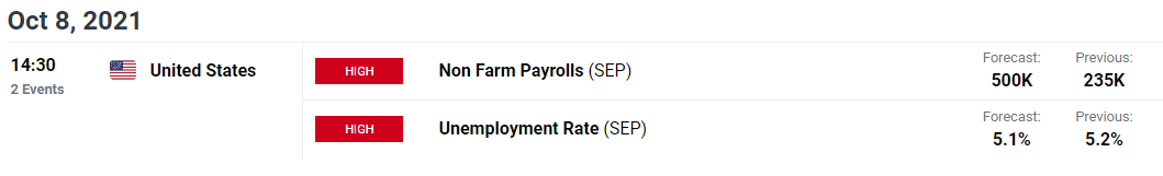
Source: DailyFX economic calendar
The greenback is currently in a bullish environment as U.S. Treasury yields maintain its recent uptick – higher yields attract investors who will need to buy dollars to invest in U.S. government bonds. In my opinion, other central banks (particularly Emerging Markets (EM)) will need to hike rates locally to stem the depreciation against the U.S. dollar otherwise many EM currencies will likely remain on the current downward trajectory.
U.S. 10-YEAR GOVERNMENT BOND YIELDS (WHITE) VS DOLLAR INDEX (GREEN) YTD:
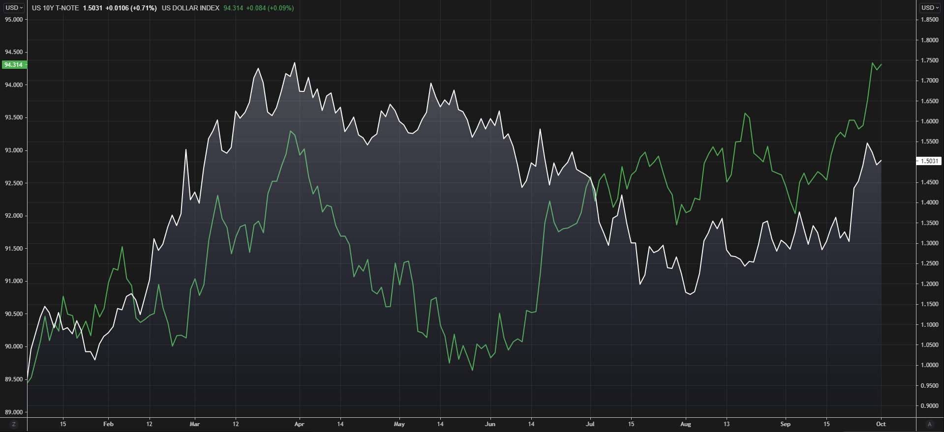
Source: Refinitiv
U.S. DEBT CEILING: A GROWING CONERN
Another important factor to consider is the U.S. debt ceiling – limit on how much debt can be acquired by the U.S.. This week, Democrats were rebuffed by Republicans on their proposal to increase the current debt ceiling. What this means is that should the U.S. be unable to make meet its financial obligations, they will default on the debt payments and potentially head for a catastrophic consequence whereby the U.S. will likely be downgraded. This should favor safe-haven currencies like the Japanese Yen (JPY), although further dumping of U.S. Treasuries may ensue thus favoring the dollar against other crosses. The graphic below illustrates the prior (orange) and forecasted (purple) debt-to- GDP (%) which is already significantly above the 100% benchmark previously considered as “high”. This is only set to increase going forward which begs the question, “where do you draw the line?”.

Source: Refinitiv
DOLLAR INDEX DAILY CHART
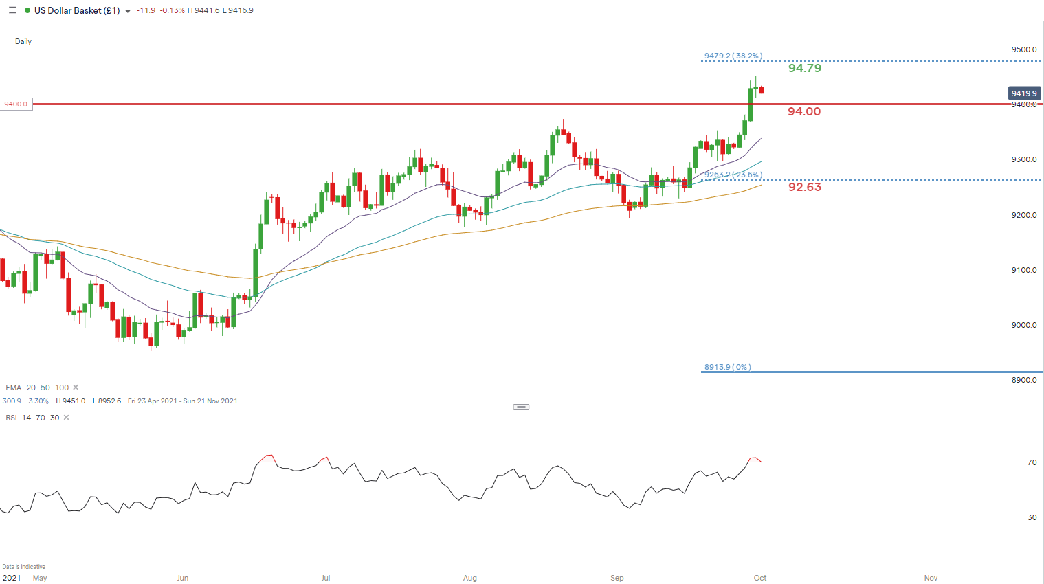
Chart prepared by Warren Venketas, IG
The daily DXY chart shows the aforementioned hiatus by dollar bulls indicative by the doji candle print yesterday. Doji’s generally necessitate indecision which ties in with the key U.S. economic data announcements later today (Core PCE and PMI’s). These prints could give markets a directional bias going into next weeks NFP’s. The Relative Strength Index (RSI) is firmly in overbought territory but expectations around a reversal cannot be relied upon. The medium-term outlook remains bullish but a move down to 94.00 support is likely before continuing the upsurge towards subsequent resistance levels.
Key resistance levels:
- 95.00
- 94.79
Key support levels:
- 94.00
- 20-day EMA (purple)
SIMPLIFYING THE NATURAL GAS CRISIS
WHY ARE EUROPEAN LNG PRICES RISING?
1. Weather
Colder than expected weather earlier this year attributed to the start of the current price rise in natural gas. Weather is a key component when forecasting gas demand and supply so anything outside of a projected range can result in knock-on effects to LNG prices. The graphic below shows TTF (European) vs JKM (Asian) and reflects European LNG (green) trading at a premium to Asian LNG (blue) currently. This premium favors further European gas price upside due to an increase in European LNG flows.
LNG POINT OF DIFFERENCE: TTF VS JKM

Source: Refinitiv
2. Carbon tax
The EU has been clamping down on carbon usage via increased carbon prices which has made the switch to gas more attractive. This is likely to continue as the focus on cleaner energy grows and the intermediary shift to gas before renewables take over.
3. Supply
Supply disruptions have been frequent this year and hampered the increased demand as global economies started to recover and re-open. According to S&P Global, China has increased its stockpiles and production to prepare for the winter/spring season ahead. The goal is to keep supplies consistent throughout the period without risk of shortages and may further exacerbate elevated gas prices globally.
NATURAL GAS (HENRY HUB)WEEKLY CHART
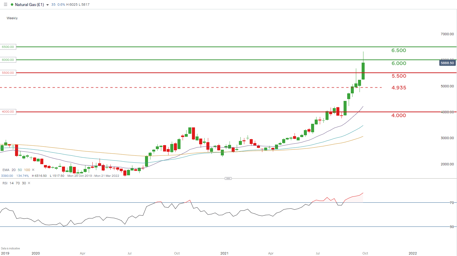
Chart prepared by Warren Venketas, IG
Extended LNG prices (Henry Hub) are apparent on the weekly chart above as the European gas price rise spills over to other regions. A pullback from recent highs is represented by the long upper wick on the latest weekly candle. Although the fundamental backdrop remains bullish, stretched price action may settle somewhat before resuming another uptick.
Key resistance levels:
- 6.500
- 6.000
- 5.500
Key support levels:
- 5.500
- 4.935 – November 2018 swing high
SECTOR ROTATION HURTS U.S. TECHS
U.S. tech stocks have carried the brunt of the recently sell-off in the U.S. government bond markets which have favored cyclical stocks such as financials. The reason behind the decline is simple, tech stocks are vulnerable to rising interest rate forecasts as their future earnings expectations are discounted when rates rise – lower valuations leading to tech slump.
Next year, with less stimulus in U.S. markets as tapering commences the move into defensive stocks may begin as economic growth decelerates. For now, the high inflationary environment is likely to promote higher treasury yields which should hold off any sort of recovery from tech stocks. Going into the final quarter of 2021, financials and energy are the preference of many.
Boost your stock market knowledge with our articles on the types of stocks available, how equities impact the economy, and getting started with stock trading.
NASDAQ 100 INDEX (NDX) DAILY CHART
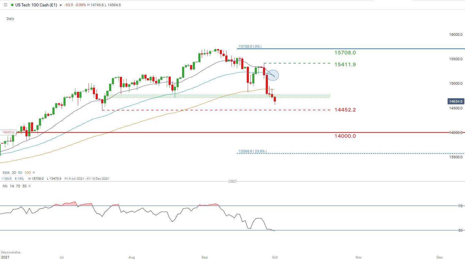
Chart prepared by Warren Venketas, IG
Price action on the NASDAQ 100 daily chart shows a strong bearish bias as the index broke below medium term support turned resistance (green). The extended move down has reflected in an oversold reading on the Relative Strength Index (RSI). There is still room for further downside which will see the July 2021 swing low (14452.4) come into consideration.
A bearish crossover (blue) is evident as the 20-day EMA crosses below the 50-day EMA which benefits a bearish outlook from a technical perspective.
Key resistance levels:
- 15708.0
- 15411.9
- 100-day EMA
- Resistance zone (green)
Key support levels:
- 14452.2
- 14000.0

--- Written by Warren Venketas for DailyFX.com
Contact and follow Warren on Twitter: @WVenketas