Nasdaq 100, Dow Jones Industrial Average, Crude Oil and Treasury Yields Talking Points
- Risk trends were shaken into the closing days of November, but the retreat didn’t exactly deflate some of the most extreme positioning like the appetite for US tech stocks
- Inflation fears have sored and the implications for economic strength have weighed, but crude oil just put in for a 20% November correction – are price pressures sliding?
- Forecasts for stimulus reduction and higher rates has touched off fears from extreme camps of a self-induced economic collapse, and the US ‘2-10’ yield spread tracks the line


Risk appetite has shown a resiliency post-pandemic that seems almost unflappable…at least if you are looking at the top performing markets. A broader review of ‘sentiment’ through a variety of generally lower correlated assets seems to show a meaningful loss of traction in recent months from the global (non-US) equities, emerging market assets, carry trade and commodities with a speculative connection. First, it is important to define ‘risk trends’: I consider it the underlying appetite for either greater return or greater safety of funds for capital allocation regardless of region or asset type. That said, when traction on mature systemic trends (like the post pandemic and post-GFC) bull trend start to flag; there is often an intensified urgency for short-term speculative returns before the momentum fully dries up – or the floor drops out, in a worst case.
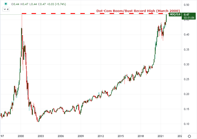
I believe the chart below epitomizes the speculative concentration as the tech-heavy Nasdaq 100 and blue-chip Dow Jones Industrial Average ratio returns to the Dot-Com bubble era peak set back in March 2000. The historical reference should not suggest things are exactly the same as back then or that we will reverse directly from this high. Rather, it highlights the extreme preference among highly correlated indices. The need to squeeze out a little more has hit extremes while the market backdrop has eroded.
Chart of Nasdaq 100 to Dow Jones Industrial Average Ratio (Monthly)

Chart Created on TradingView
Extremely accommodative monetary policy regimes adopted and scaled over the past decade were always meant to be a temporary strut for ailing economies, but somewhere along they became dangerously important to the structure of the financial system. With so much exposure in the markets, increasing the cost of capital represented a serious struggle for investors. Now, the major central banks of the world are being forced to face the flagging ineffectiveness of their programs not due to a strategic withdrawal but in a rushed response to stubborn inflation.
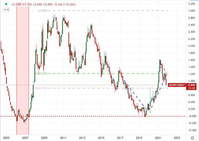
There are reasonable debates to be had about the wisdom of withdrawing the exceptional accommodation now, including recognition that it could trigger/amplify an overdue financial market retreat or that it could cool an economic recovery that is already slowing and is facing a fourth wave of infections from the persistent coronavirus. Inaction can carry as many risks as moving too early, and policy officials seem intent on starting the process while acclimating the market. To gauge the trade off of higher rates threatening a stall out of economic activity, I will refer to one of the macro-standards: the 2-10 yield spread. In reality is the US 10-year Treasury yield deducted from the 2-year duration. Should it continue to slide – and especially if it is on course to invert – it is considered a historical recession signal.
Chart of US 10-Year to 2-Year Yield Curve (Monthly)

Chart Created on TradingView
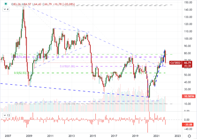
While it is important to track monthly inflation stats from the US, Eurozone and other major countries; that data very often lags and there is always discussion over the appropriateness of the indexing. If you want to get into the economic weeds of those matters, have at it. However, I find energy costs a fairly good macro measure that operates through real cost and consumer expectations in real time. That said, crude oil has been racing higher since its brief inversion back in April 2020. The WTI benchmark of crude in the US hit six year highs just a month ago, which rose serious concerns about inflation cutting into growth and prompted Western leaders to pressure OPEC and release domestic strategic reserves.
Whether through these actions or a natural market reaction, crude put in for a -20 percent drop through November. That is one of the third largest single-month slide back to the height of the Great Financial Crisis back in 2008. Could this be a sign of economic growth starting to recede through a demand curb or could this prompt the Federal Reserve and others to slow their efforts to reverse course? Keep track of this chart to find out.
Chart of US Crude Oil with Volume and 1-Month Rate of Change (Monthly)

Chart Created on TradingView


