


The premise behind trading strong trends is that a trader will be able to identify the direction in which the market has been taking the pair over time. By trading the pair in only that direction, a trader will be increasing the likelihood of having a successful trade since they are trading with the momentum of the market behind their trade.
Personally, I prefer to consult a Daily chart for the trend. For me I find it a good blend between a much longer term chart, such as a Weekly or a Monthly, and an intraday chart such as a 1 hour or 15 minute.
On the Daily chart of the NZDCHF pair below, we see an excellent example of a pair that is in a strong uptrend…
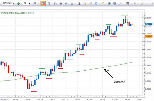
First off, we can simply see that price is moving up at roughly a 45 degree angle from the lower left to the upper right side of the chart…that is our first visual cue.
In more technical terms, the pair is trading above the 200 SMA, price action has been making higher highs (noted in green) and higher lows (noted in red) since May 18, and the NZD is a strong currency at the time of this chart while the CHF is a weak currency.
Given all this information, as traders we now know that we only want to look for opportunities to buy this pair as that will put the odds of having a successful trade more in our favor.
Now let’s take a look at a pair that is in a strong downtrend…the GBPAUD.

Our first visual cue in the case of this chart is that price is moving down at roughly a 45 degree angle (the steeper the angle the stronger the trend) from the upper right to the lower left of the chart.
Beyond that we can see that the pair is trading below the 200 SMA, price action has been making lower highs and lower lows since May 23, and the GBP is weak and the AUD is strong at the time of this chart.
With this information, as traders we now know that we only want to look for opportunities to sell this pair as that will put the odds of having a successful trade more in our favor since we are trading the pair in the direction that is favored by the market.
As a bonus, here is a chart that as one who trades strong trends I would avoid…

In the case of this GBPUSD Daily chart we can see that since the end of May the pair has been trading flat…in a range. All the highs are about the same and all the lows are about the same as well. Price is trading right along and just below the 200 SMA and the GBP and the USD are both weak currencies. As far as trend trading this pair goes, there is no discernible trading edge.
A range trader however, might look at this pair as a very likely candidate.