


When a trader buys or sells a currency pair – they are simultaneously going long one currency and short another. To traders coming from other markets, this concept may initially sound vexing, but it really isn’t all that different than stocks.
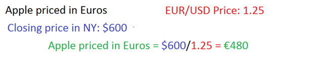
After all, if we are trading in Google or Apple in the United States, but using Euro’s to do it – there is a currency transaction going on there, right?
The table below would show how a trader could find the price of Apple in Euros, assuming a closing price of $600 on Apple with a price of 1.25 on EUR/USD.
Finding Equal Footing
One of the difficulties that can arise when comparing currency pairs to each other is the fact that each pair has its own price structure (just because GBPUSD is trading at 1.55 and AUDUSD is trading at 1.025, GBP is not necessarily 'better' than AUD).
So the first thing that we need to do when comparing pairs is to equalize the differences between all of the available pairings.
We can do this by focusing on ‘major’ pairs – or those pairs that have the US Dollar in them. By comparing all currencies with the USD in them, we can then begin to make an ‘apples-to-apples’ comparison of each.
We can start by setting up a very simple table of the major currency pairs:

A sample table when setting up Strong/Weak Analysis
Setting the Time Frame
The next step is to decide on the period of time with which we want to analyze. For traders utilizing multiple time frame analysis, they would want to look at the longer-term ‘trend’ chart for this part of the process.
For this article, we will walk through the time frames commonly utilized by the ‘short-term trader,’ in which trades are being placed on the one hour chart and trends analyzed on the 4-hour.

Common Multiple Time Frame Analysis Intervals; From The Time Frames of Trading
Because trades are being placed on the hourly chart, the trader would want to perform their strength analysis on the longer time frame ‘trend’ chart.
The trader can navigate to the 4-hour chart, and measure the change for each of the aforementioned currency pairs. The chart below will illustrate how this can be done on the AUDUSD currency pair:
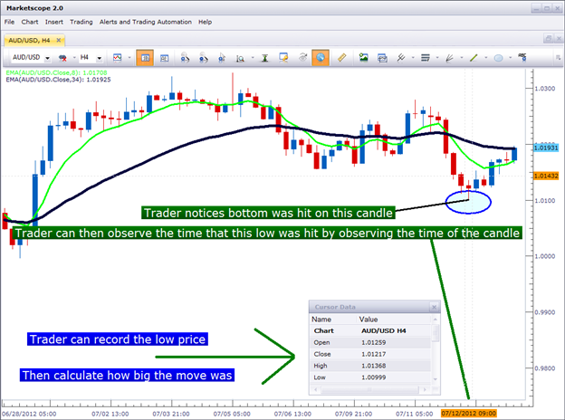
Created with Marketscope/ Trading Station
The trader notices that the AUDUSD currency pair made a low in the market on the 7/12/2012 bar at 09:00, with a low price of 1.0099.
The trader can then observe current market price, and notice that since this low point was hit on 7/12/2012 at 09:00, price has moved up 113 pips.
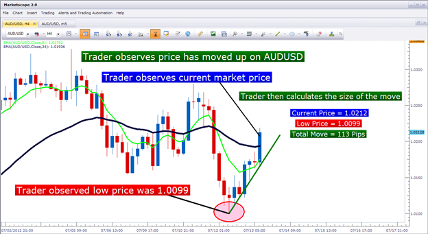
Created with Marketscope/ Trading Station
Our trader can then record these numbers in the simple table we created a little earlier:

And then we can move on to the next currency pair. This time, we’ll observe what’s happened in EURUSD over the same period:
Created with Marketscope/ Trading Station
After performing the same type of analysis on EURUSD, we discover that the low price of the 07/12/2012 09:00 candle was 1.2172, with a current market price of 1.2235. This means that EURUSD showed a 63 pip gain over the same period that AUDUSD showed a 113 pip gain. We can record this data and move on to the next currency pair until we’ve completed the table.
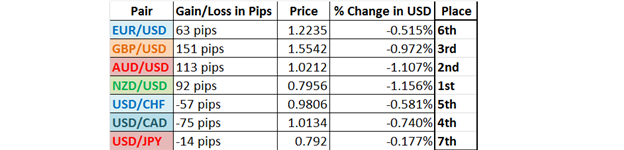
Once the table is complete, we can then begin to see which currencies have been strongest or weakest against our common currency: The US Dollar.
The first thing we may notice is that the US Dollar lost against each of the 7 observed currency pairings. Of note here – the top 4 pairs listed in the table were USD counter-currency pairings, in which weakness in the US Dollar would equate to gains in the pair. The last 3 pairings listed are pairs in which the US Dollar is the base currency; and losses in these pairs would equate to US Dollar weakness.
From our table, we can see that NZD has been the strongest currency against the US Dollar, as NZDUSD had gained 1.156% against USD since the 07/12/2012 09:00 low that we had previously observed.
Despite the fact that the AUDUSD currency pair had gained over 20 pips more than NZDUSD, the percentage gain of NZDUSD would offer the trader a sign that there was more strength to have been found in NZD as opposed to AUD.
We can then order our table from strongest to weakest.

Now that we know which currencies have shown the most strength, and which have shown the most weakness – we can integrate this data into our approach; whether that approach is short-term, long-term, or swing trading – we can do the same type of analysis to provide additional insight into which pairings we may want to be looking at.
In our next article, we’ll look at how we can use this information in our strategies to focus on pairings that may be most amenable to our goals.
--- Written by James B. Stanley
You can follow James on Twitter @JStanleyFX.
Additional Resources: