


Earlier in the sub-module we introduced the topic of support and resistance when using price action and we started by focusing on a very important part of price action analysis: The Wick.
Quite simply a wick is showing an intra-candle reversal. And if that intra-candle reversal is especially large, then the momentum that created that reversal may continue to the next candle, and the candle after that.

In that scenario the main takeaway is the point at which the wick began to form – which is the same price at which the reversal started to show on lower time frames – is a resistance price of relevance and something that traders can follow on their chart for future trade setups or analysis.
But – what about when multiple wicks align at the same price point?
You might remember the final point of our last article, in which I wanted to draw your attention to a red line on that USD/JPY chart. I’ll post it again below to highlight what I’m talking about.
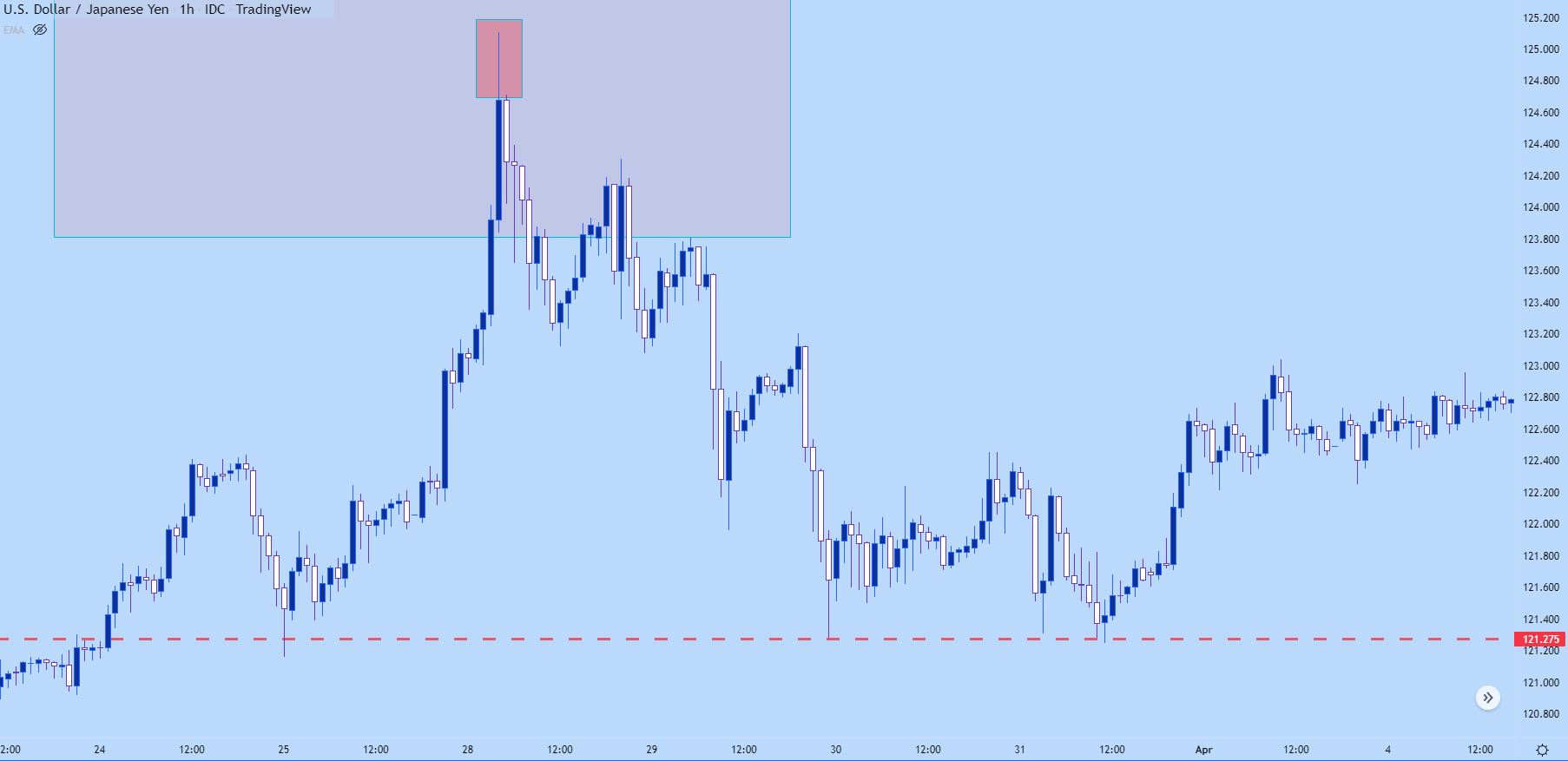
Chart prepared by James Stanley; USD/JPY hourly chart, late March – early April 2022
Previously we were looking at the reversal as started by the extended wick on this hourly chart. But, look at what happened at the red line after the move had priced-in.
As price hit the red line after topping, the sell-off stopped. Sellers took another swing but when touching that level for a second time, similarly, the sell-off stopped.

This is indication of support. Below, I take a closer look at this item with a blue box around each bounce. I’ve also added a green line that we’ll talk about a little later.
USD/JPY Hourly Price Chart
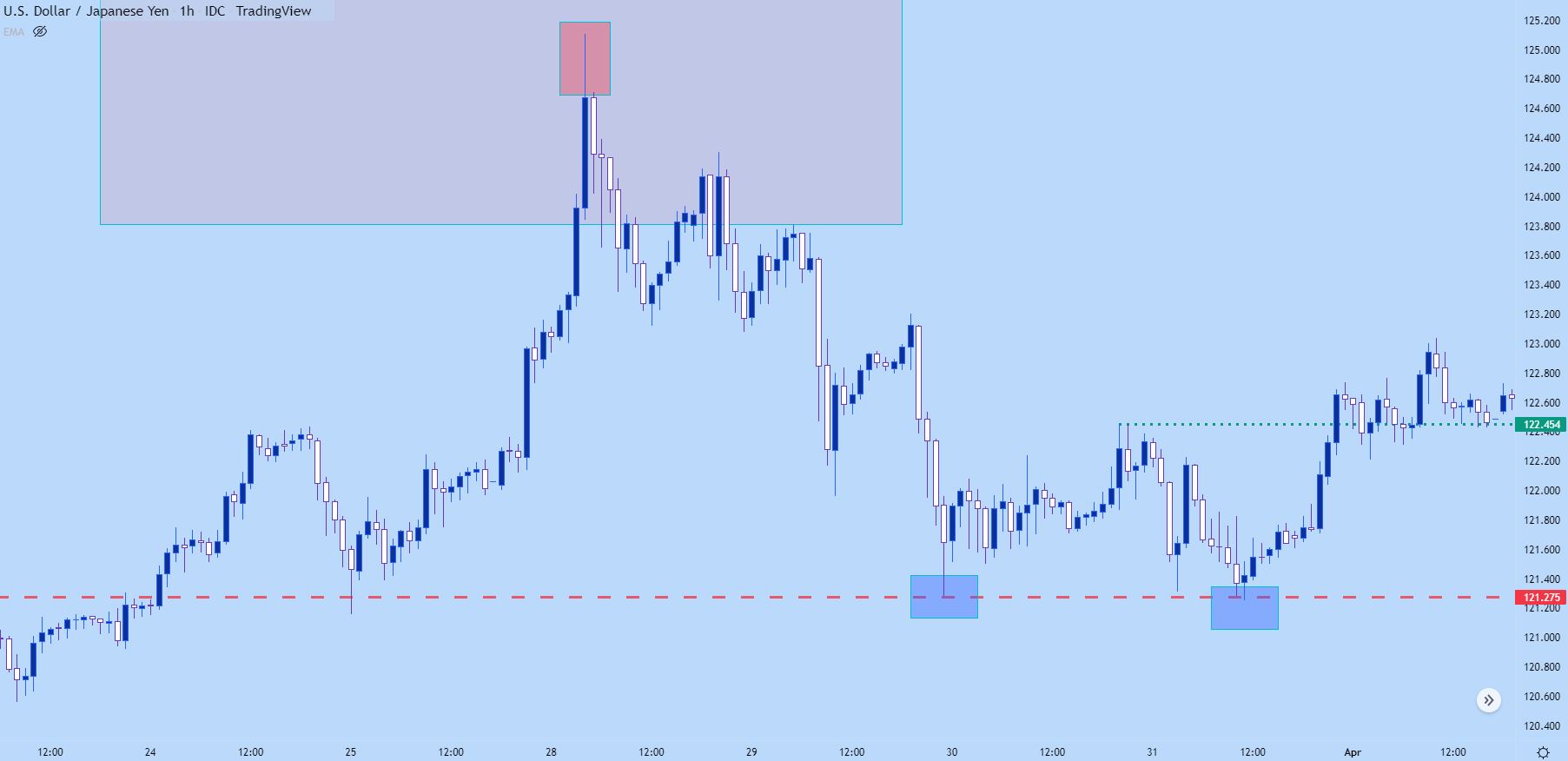
Chart prepared by James Stanley; USD/JPY hourly chart, late March – early April 2022
When a point of support shows two inflections, that brings up a possible double bottom formation. Such formations are often followed with the aim of bullish reversals, driven by the premise that price hit a level of support that it could not breach and, eventually, that support played out with buyers reversing the trend to bring on higher prices.
Remember that green line? Well, that would be called the ‘neckline’ from such a formation, and it’s simply the high point between the two support inflections. A breach of that neckline opens the door for bullish trends as a short-term breakout takes hold.
In the below example, we can see where that breakout hits shortly after the second support inflection, after which the green line of prior resistance is soon re-purposed as support before the bullish trend launches higher.
USD/JPY Hourly Price Chart
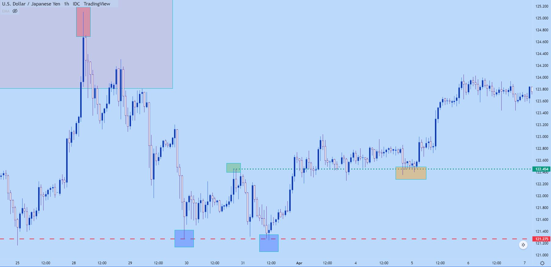
Chart prepared by James Stanley; USD/JPY hourly chart, late March – early April 2022
Wick Sequencing
Let’s look at that same example again but, this time we’ll use a four hour chart. The benefit of a four hour chart is that we’re getting a lot more information in the same number of candles but, the trade-off is less granularity.
But, price is price, and whether that price served as support or resistance on a one minute or a weekly chart, it will show on the candlestick chart as an inflection.
Introduction to Technical Analysis
Technical Analysis Chart Patterns
Recommended by James Stanley
But – when we get a grouping of candles all showing wicks in a similar area – that’s highlight a key price level that’s at work, continuing to drive price flows in that market as it comes into play. On the below chart, notice the orange boxes, one on left and the other on the right side of the chart.
The first orange box is showing resistance which later became support. And the second orange box shows support that was prior resistance. The key being that these prices didn’t just drop on the chart, there was prior reference at these levels from previous days’ trading activity.
USD/JPY Four-Hour Price Chart
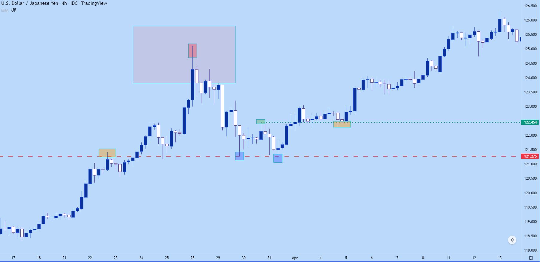
Chart prepared by James Stanley; USD/JPY hourly chart, late March – early April 2022